The screen reader was moving faster than any of us could follow. The person driving it wasn’t struggling to keep up; he was the one in control.
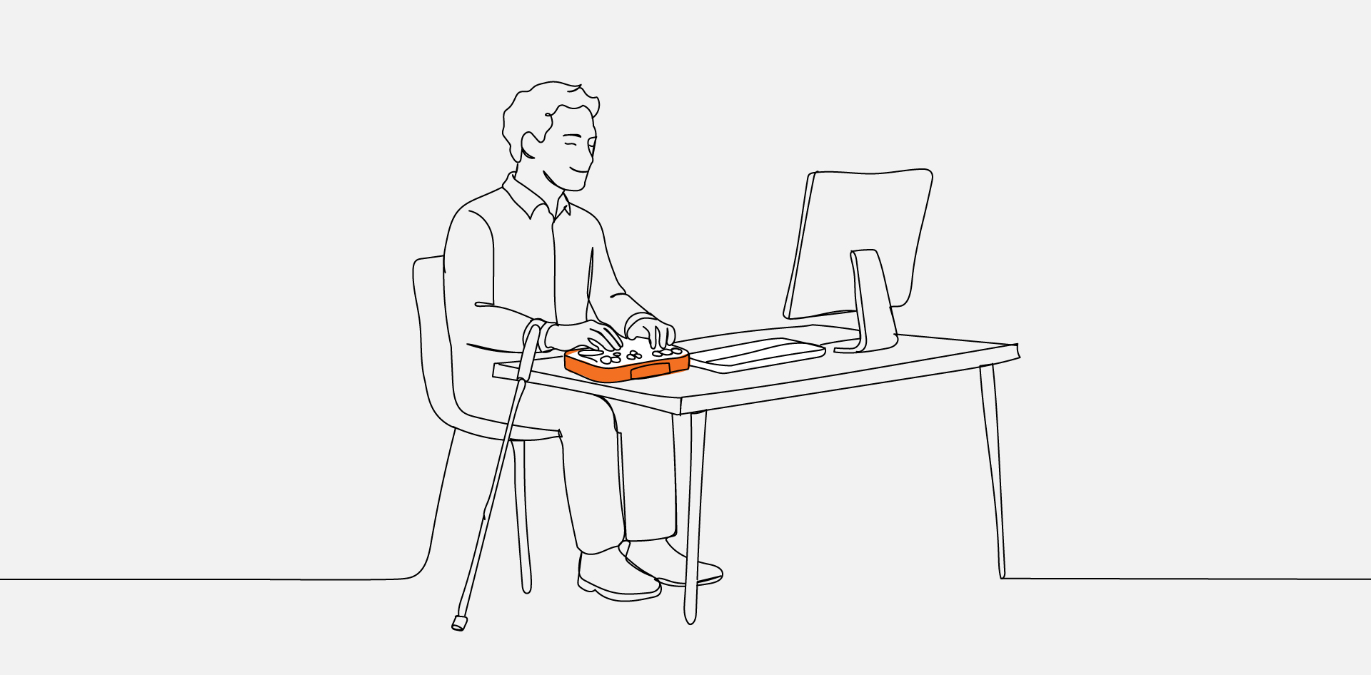
We’d brought in a blind, certified Section 508 compliance tester to spend the day with our team, and we watched him move through a live website using only a screen reader and a refreshable Braille display.
Within seconds, he’d built a mental map of the page that took the rest of us, looking at the same screen with our eyes, far longer to piece together.
That gap between how we assumed people use the web and how they actually use it is exactly why we set the session up. What follows isn’t a standards lecture. It’s what changed in how our developers think after watching someone navigate the web from the other side of the screen.
1. Watching the Web Without Sight
A screen reader doesn’t see a page the way you do. It flattens everything into a single linear stream and reads it from top to bottom, announcing each piece as it goes: “Heading level 1,” “navigation landmark,” “list with five items,” “link, current page.”
That linear stream is the entire experience. When he wanted to reach the main content, he didn’t scan with his eyes; he pulled up a list of every heading and every landmark on the page and jumped straight to the one he needed.
Structure Is the Interface
That’s the part that reframed it for our team. For a sighted user, structure is mostly visual polish. For someone using assistive technology, structure is the interface.
When the headings run in a logical order, and the landmarks are labelled correctly, the page becomes a clean table of contents that he can move through at will.
When a heading level is skipped, or a <nav> and <main> aren’t defined, that table of contents collapses, and the only option left is to wade through the whole page one element at a time.
2. Accessibility Is Bigger Than Blindness
It would be easy to walk away thinking accessibility is mostly about screen readers. Our tester made a point of widening that view by playing a video he’d brought along.
The clip showed a user with limited mobility operating a computer using only three fingers and voice control, with no mouse involved at all. To this person, every button, link, and form field had to be reachable and operable by keyboard and spoken command—because that’s the only way they reach it.
The lesson connected directly back to the screen-reader demo. A mouse-only interaction, a custom dropdown that traps focus, a button that’s really just a styled <div>—each of those quietly shuts out an entire group of people, even when the page looks perfectly fine to everyone else.
3. Where Good Intentions Quietly Break
Most of the barriers we saw weren’t the result of anyone cutting corners. They came from well-built sites where one small decision created a wall for someone relying on assistive technology.
A few patterns came up again and again in the session:
- Form timeouts that expire mid-task, before someone navigating by voice or Braille has had time to finish.
- Headings used for visual sizing, like a date styled as an <h2> just because it looked right, which scrambles the document outline that a screen reader depends on.
- Vague link text such as “click here” or “read more,” tells a screen-reader user nothing once it’s stripped of the surrounding visual context.
- Inaccessible CAPTCHAs, where a colour-based or “traffic light” challenge is a flat dead end for a blind user.
The CAPTCHA example landed the hardest. A test built to prove you’re human can be the exact thing that locks a human out, which is why offering more than one format—audio, a simple math question—matters so much.
4. The Standards Behind the Experience
None of this was framed as a compliance exercise, and that order felt deliberate. The human experience came first, and the standards were introduced as the reasoning behind the practices, not the headline.
WCAG 2.1 is the global benchmark for web accessibility, and most of what we watched him rely on maps directly to its guidelines. In the US, Section 508 takes it a step further by making accessibility a legal requirement for government-related projects.
Reframing the standards this way made them stick. “Use semantic HTML and label your forms” is an instruction that’s easy to nod at and forget. “Build it so a screen-reader user can find your contact page in four seconds” is a goal you remember.
5. Tools Find Errors, People Find Barriers
There’s a comfortable assumption in our field that an automated scanner can tell you whether a site is accessible. The session made it clear how partial that picture is.
Automated tools are genuinely useful for catching structural problems at scale: missing alt text, low-contrast colour, unlabelled fields. The catch is that they check whether the code is technically correct, not whether a real person can actually accomplish anything.
What Only a Human Can Catch
A scanner will never tell you that the focus order jumps around in a way that’s impossible to follow, or that the link text is technically present but completely meaningless out of context.
Those are the barriers that only surface when an actual assistive-technology user sits down with the site.
That’s also why manual testing is treated as a profession in its own right. The DHS Trusted Tester program certifies people to evaluate Section 508 compliance by hand—the same credential our tester holds—and watching him work made it obvious why that human layer can’t be automated away.
Building From the User’s Side of the Screen
The most useful thing we took from the session wasn’t a checklist. It was a change in vantage point, from auditing a page against rules to imagining a specific person trying to get something done on it.
That shift is exactly how we approach the way we build for the agencies we partner with, and it’s the thinking behind our accessibility audit and remediation work, where the goal is to catch these barriers long before a real user ever hits one.
Accessibility works best when it’s a foundation laid from the first wireframe, not a layer of fixes bolted on once a scanner flags a problem the week before launch.
One message ran through the entire day, and it’s the right note to end on. Accessibility isn’t a feature you add or a box you tick; it’s a human right, and building for it means building for the full range of people who’ll actually use what you ship.
Frequently Asked Questions
Not when it’s planned in from the start. Most accessibility requirements—semantic structure, keyboard support, sufficient contrast—are cheap to build in early and expensive to retrofit later. The constraint tends to sharpen design decisions rather than restrict them, because it forces clarity in navigation and hierarchy that benefits every user. They’re related but not identical. WCAG is a technical standard maintained by the W3C, while the ADA is US civil rights law that doesn’t name a specific version of WCAG in its text. In practice, conforming to WCAG Level AA is the widely accepted way to demonstrate a good-faith accessibility effort, which is why it’s treated as the working benchmark even where the law doesn’t spell it out. Accessibility isn’t a one-time audit. Every new feature, template, or third-party widget can introduce barriers, so testing belongs in the regular development cycle rather than as a single pre-launch check. A practical rhythm is automated scanning on every build, with periodic manual testing by an assistive-technology user whenever something significant changes. Overlays are widely criticised by accessibility experts and assistive-technology users, and they don’t reliably deliver compliance. They sit on top of the underlying code rather than fixing it, which means the structural problems a screen reader actually trips over usually remain. Real accessibility comes from the markup and the build, not a script layered over the top. Few agencies do, and building that capability from scratch is slow and expensive. This is one of the clearest cases for a white-label partnership: the agency keeps the client relationship while a specialist team handles accessible builds and remediation behind the scenes. It’s how a small shop can deliver genuinely accessible work without hiring a full accessibility practice to do it.
FAQs
Does building for accessibility slow down projects or limit design?
Is meeting WCAG the same as being ADA compliant?
How often should a website be tested for accessibility?
Can an accessibility overlay or widget make my site compliant?
What if my agency doesn’t have accessibility expertise in-house?