
When Apple launched the original iPhone in 2007, websites broke. Literally.
Suddenly, pixels that looked perfect on desktop exploded into chaos on tiny touchscreens. What followed was a race—between responsive design that flexed to every screen, and adaptive design that tailored for specific ones.
Today, agencies still face that choice.
But it’s no longer just about devices. It’s about how your design decisions affect team velocity, client satisfaction, and platform-specific polish.
In this post, we’ll unpack the core differences—and show you how to choose not just based on screen size, but on strategy, scale, and service delivery.
What Responsive and Adaptive Really Mean (Without the Jargon)
Before choosing between responsive or adaptive, agencies need more than textbook definitions. You need to understand how each one behaves—especially when juggling multiple client expectations, platforms, and budgets.
Let’s break it down:
Responsive Design
Responsive design uses a fluid layout that adjusts automatically to fit any screen size. The content shifts, scales, or reflows based on breakpoints, ensuring a consistent user experience across mobile, tablet, and desktop—with a single design system.
What it means for your agency:
One flexible build. Faster implementation. Easier to manage long-term. Great for content-driven sites or clients who need broad accessibility without platform-specific tailoring.
Adaptive Design
Adaptive design creates multiple fixed layouts—each tailored to specific screen sizes or devices. When a user visits the site, the system detects the device and serves the most appropriate layout version.
What it means for your agency:
More upfront design and dev work, but with greater precision. You can fine-tune the UX for specific devices—perfect for high-touch experiences, performance-critical sites, or premium branding.
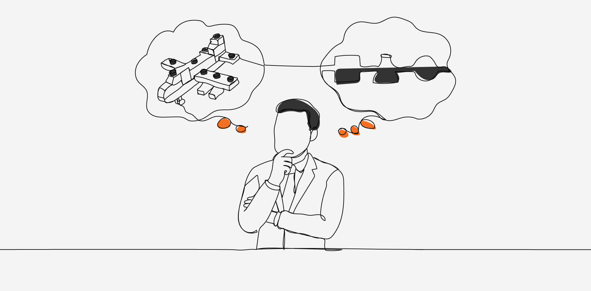
Metaphor That Helps: Imagine responsive design like water—it fills whatever glass you pour it into. Adaptive is more like having different cups for each occasion—a coffee mug, wine glass, water bottle—each one built for a specific use case.
For agencies, the main takeaway is this:
Responsive is flexible and efficient
Adaptive is precise and customizable
Which one fits best? That depends on what you’re trying to pour—and who’s drinking.
Key Differences Agencies Must Understand
For agencies, the responsive vs adaptive debate isn’t just about front-end code. It touches everything from proposal strategy to QA bandwidth. Here’s where the rubber meets the road.
Design and Development Workflow
Responsive: Typically involves designing one flexible layout with breakpoints. Designers focus on fluid grids, and devs handle layout changes with CSS media queries.
Adaptive: Requires creating multiple layouts for different devices—each one manually crafted. More precision, but more time.
Agency takeaway: Responsive speeds up cross-team handoffs; adaptive demands tighter coordination between design, dev, and QA.
Content Strategy and Flexibility
Responsive: Content naturally flows across layouts. Great for scalable content marketing, editorial sites, and dynamically updated platforms.
Adaptive: You can control exactly what’s shown where—ideal for experiences where content needs to vary between mobile and desktop.
Agency takeaway: Responsive is ideal for content-driven clients. Adaptive can serve high-touch B2B or product-driven brands better.
Time to Launch
Responsive: Quicker to launch and easier to update post-launch.
Adaptive: More planning and design upfront. You’re basically building several mini-sites.
Agency takeaway: If the timeline is tight, responsive buys speed. If the client expects polish across platforms, adaptive might be worth the lift.
When to Use Responsive Design for Client Projects
Responsive design isn’t just “the easier option”—it’s often the most strategic for agencies aiming to streamline builds while still delivering a consistent, quality user experience across devices. It makes the most sense in:
Tight Deadlines or Limited Budgets
Building and testing a single flexible layout reduces design/dev hours and QA load. For many agency timelines, that matters.
Broad, Unpredictable Device Reach
If you don’t know what devices end-users might be on—or if they’re likely using many—responsive ensures smooth accessibility across the board.
Content-First Websites
Blogs, digital publications, educational platforms, or e-commerce catalogs benefit from fluid layouts that let content adapt naturally.
Ongoing Maintenance and Scale
With only one core layout system, it’s easier to push updates, run A/B tests, and manage SEO performance over time.
Responsive design aligns well with mobile-first strategies, especially as Google prioritizes mobile usability for rankings. It also minimizes technical debt—something agencies handling multiple client sites will appreciate long-term.
For agencies, responsive design is often the default not because it’s basic, but because it’s resilient. It adapts to change, minimizes team bandwidth strain, and supports growth without demanding total reinvention.
When Adaptive Design Might Be the Smarter Move
Adaptive design can feel like more work upfront—and that’s because it is. But in the right contexts, the payoff is precision, performance, and tighter control over the user experience. Adaptive becomes worth the investment when:
You’re Working with Known Devices or User Segments
Adaptive design shines when you know the target devices—like designing for an internal tool used only on iPads or a customer portal used mostly on desktops.
Pixel-Perfect Branding Is Non-Negotiable
Some clients want luxury-level polish. With adaptive, you can fine-tune layouts, spacing, and UI behavior for specific screens to create a highly curated experience.
Page Load Time Is Mission-Critical
Because adaptive loads only what’s needed for that specific device, it can deliver faster perceived performance—particularly on mobile.
You Need to Serve Different Content by Device
Unlike responsive design, adaptive allows entirely different layouts, modules, or even messaging per device type. This is valuable when a brand wants mobile users to see different calls-to-action or flows than desktop users.
Advanced Accessibility or Compliance Needs
In some regulated industries, offering a fully customized and validated experience on specific devices might be necessary—and adaptive design supports that level of control.
For agencies, adaptive is less about “being modern” and more about meeting specific needs. If your client is asking for precision, speed, or variation across platforms, adaptive design gives you the toolkit to deliver—just be ready to invest more time in design, dev, and testing cycles.
Client Education Tips Explaining the Difference to Non-Tech Stakeholders
Clients don’t need a lesson in CSS—they need clarity and confidence. Here’s how to break down the responsive vs adaptive conversation without the tech overload.
Use relatable metaphors
“Responsive is like water—it fits any glass. Adaptive is like having a different cup for each drink: mug, wine glass, bottle.”
It lands faster than explaining breakpoints.
Tie it to what they care about
“Responsive is faster to launch and easier to update.”
“Adaptive gives more control over how things look on each device.”
“Responsive keeps costs lower long-term. Adaptive is higher-touch.”
Show, don’t just tell
Use simple visuals or mockups to highlight the difference. Even basic sketches help.
Be direct with your recommendation
Don’t ask what they want—tell them what fits.
“For your timeline and budget, responsive is the smarter move.”
“For that polished brand feel, adaptive will serve you better.”
Collaboration Considerations for Your Agency Workflow
Choosing responsive or adaptive design isn’t just about the final product. It also affects how your internal teams work together—and how smoothly a project runs from kickoff to launch.
Responsive Design Supports Faster Handoffs
Since there’s one flexible layout, collaboration between design and dev is more linear. Designers set breakpoints, devs build to match, QA checks how it scales. It’s ideal for fast-moving teams and templated projects.
Adaptive design requires tighter coordination
With multiple fixed layouts, every screen size becomes its own mini-project. Designers, developers, and testers need to sync closely on specs, assets, and behavior for each version. That means more checkpoints and more time.
Think about post-launch too
Responsive: one system to update and maintain
Adaptive: updates might need to be duplicated across layouts
Agency takeaway: Responsive reduces friction and scales better for repeatable work, while Adaptive gives you control—but only if your team has the process to support it.
Making the Right Call for Your Clients
There’s no one-size-fits-all winner in the responsive vs adaptive debate. The best choice is the one that aligns with your client’s goals, timeline, and brand expectations—and your agency’s capacity to deliver.
Here’s a simple decision lens you can use during planning:
Go Responsive If
Your client needs to launch fast
The site must work well across many devices
You’re working with a tighter budget
Content is dynamic and frequently updated
You want simpler long-term maintenance
Go Adaptive If
Your client demands pixel-perfect layouts across devices
There’s a clear list of target screens (e.g., iPads, desktop only)
You need different UX flows for mobile vs desktop
The brand is high-touch and highly visual
You have bandwidth for more design, dev, and QA coordination
Agency Tip: Don’t just ask what the client wants—ask what the site needs to do, who it’s for, and how often it will evolve. Let those answers guide your design approach.
The Real Question: What Are You Really Designing For?
When the brief lands on your desk, it rarely says “Make it responsive.” Or “Build it adaptive.” What it really says is: make this site work—for our users, our brand, and our business goals.
That’s why this isn’t a tech decision. It’s a strategic one.
Agencies that thrive don’t just pick the tool—they match the tool to the timeline, the team, and the transformation the client is chasing. Responsive keeps things nimble and scalable. Adaptive dials in control and finesse. Both can be right. But only one is usually right now.
So, ask yourself: What’s the clearest path from where the client is… to where they want to go?
And then design accordingly.
FAQs
What’s the Key Difference Between Responsive and Adaptive Design?
Responsive design uses one flexible layout that adjusts to any screen size, while adaptive design uses multiple fixed layouts tailored to specific devices. Responsive is fluid and efficient; adaptive offers precise, device-specific control.
When Should Agencies Use Responsive Design Over Adaptive?
Use responsive design when:
The project has a tight deadline or limited budget
The site must work across many unknown devices
Content updates are frequent
Long-term maintenance needs to be simple
What Are the Main Advantages of Adaptive Design for Agencies?
Adaptive design is ideal when:
You’re designing for known device types
Pixel-perfect branding is essential
You need to show different content on mobile vs desktop
Performance and loading speed are top priorities
How Can Agencies Explain Responsive vs Adaptive Design to Clients?
Use metaphors and client-focused language:
“Responsive is like water—it fits any glass.”
“Adaptive is like having the perfect glass for each drink.”
Also explain trade-offs in speed, control, cost, and polish based on the client’s goals.
How Does the Choice Between Responsive and Adaptive Affect Agency Workflows?
Responsive supports faster handoffs and easier post-launch updates
Adaptive demands tighter coordination between design, dev, and QA
Choose responsive for speed and scalability; adaptive when control and variation are critical.